Non-Profit · Cultural Identity
Heritage preserved, digitally amplified.
Translating a soulful mission of women's empowerment and Indian arts into a dignified, bilingual digital anchor.
Visual Identity
Bilingual UI
Story-led Web
Non-Profit Branding
samaroh.org.in →
01 · The challenge
The "Digital Gap": Soulful mission, sterile presence.
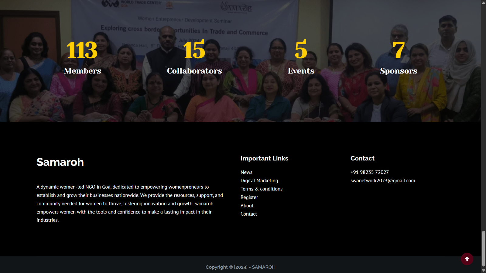
Samaroh does incredible work in the realm of cultural preservation and women's empowerment, but their digital presence didn't match their physical grace. Most non-profit sites feel like "forms and filings"—they are functional but lack emotion. The challenge was to build a site that felt like a welcoming gallery: a place that respected tradition while speaking a modern, global design language.
02 · The approach
Design as a bridge to heritage.
Bilingual Harmony
Integrating Devanagari and Latin scripts not as translations, but as equal design elements that celebrate duality.
Cultural Palette
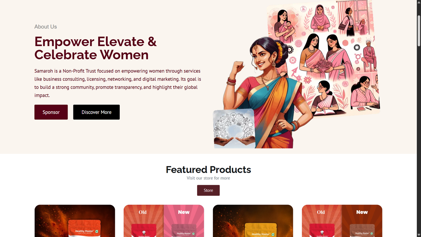
Moving away from "charity blue" to a deep maroon and gold system that evokes Indian royalty and artisan craft.
Emotive Journey
Structuring the site not as a set of pages, but as a narrative—from the "Vision" to "Impact" to "Action."
03 · The build
A digital home for culture and grace.
The Stack
PlatformWordPress · Elementor
IdentityBilingual Typography System
GoalCommunity Growth & Awareness
Timeline3 Weeks